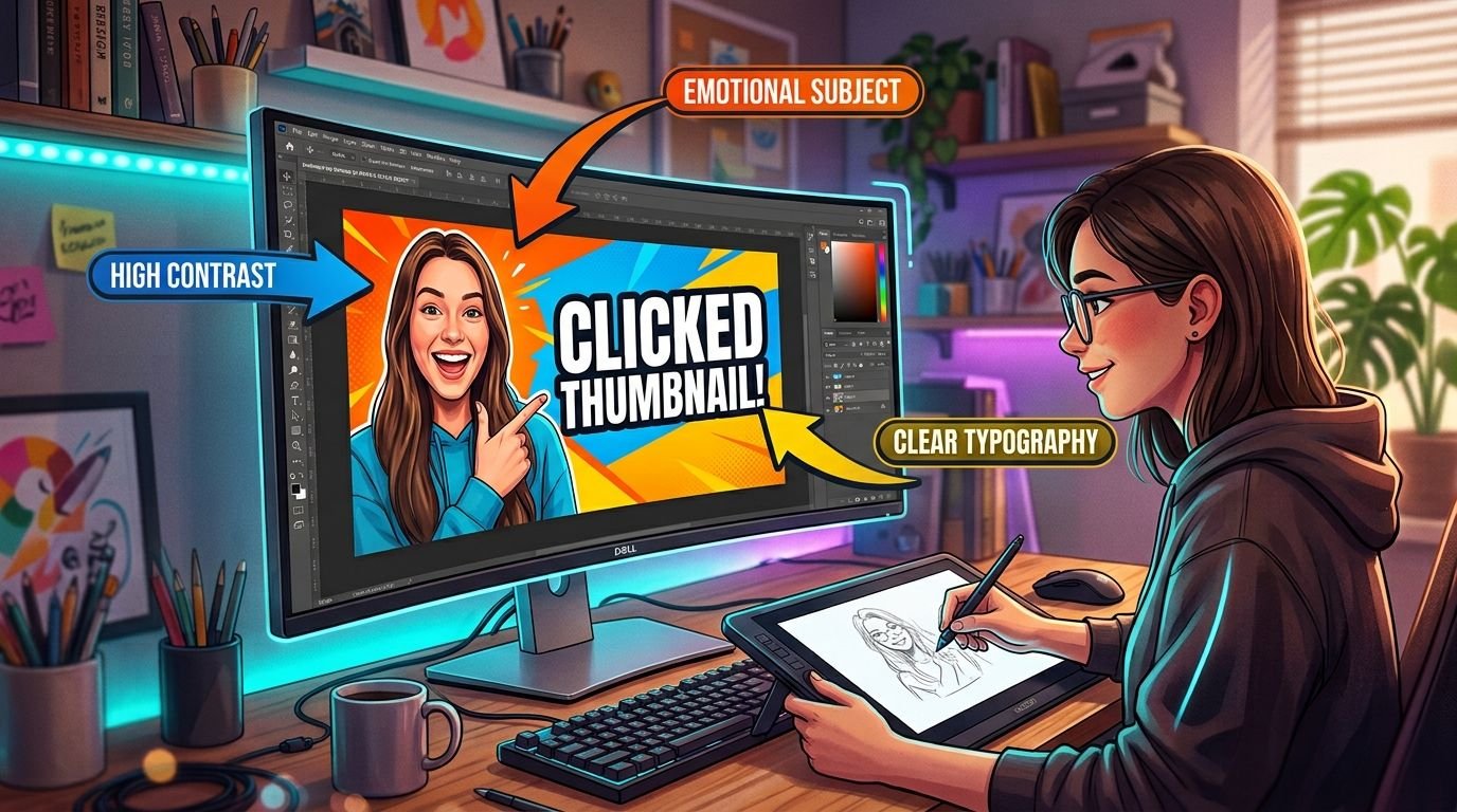
A thumbnail has one job: earn a click in the half-second someone’s eyes pass over it. That’s a completely different design problem than a logo or a webpage, and it comes with its own rules.
Contrast first, detail second
At the size most viewers actually see a thumbnail – often under 200 pixels wide on a phone – fine detail disappears. What survives is silhouette, contrast, and color blocking. If a thumbnail doesn’t read clearly at thumbnail size, it won’t perform any better at full size.
Faces and emotion do heavy lifting
Human faces, especially expressive ones, are one of the fastest things the eye locks onto while scrolling. A clear, emotionally readable expression – surprise, excitement, concern – gives a thumbnail an immediate hook that abstract graphics usually can’t match.
Text: three words, maximum
Thumbnail text isn’t a caption, it’s a headline fragment. If it needs more than three or four bold words to make sense, it’s competing with the video’s actual title for the same job. Big, high-contrast, and short wins over clever every time.
Color psychology, used deliberately
Red and yellow tend to pull the eye fastest, which is exactly why they’re overused – a thumbnail that’s all red in a feed full of red thumbnails stops standing out. Deliberate, brand-consistent color choices that still contrast against a platform’s UI usually outperform “loudest wins.”
Consistency builds a channel, not just a thumbnail
A style viewers recognize before they’ve even read the title – consistent framing, a repeated color treatment, a signature layout – builds channel-level trust that a one-off “best” thumbnail never will.
The best-performing thumbnails aren’t the loudest ones. They’re the ones designed for how they’re actually seen: small, fast, and surrounded by competition.