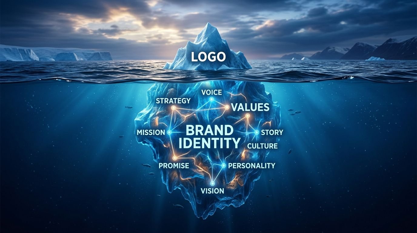
“Can you design us a logo?” is one of the most common first messages we get – and it’s almost always really a request for something bigger. A logo is one asset. A brand identity is the system that makes that asset, and everything else the business puts out, feel like it belongs to the same company.
What a logo actually is
A logo is a single mark – a wordmark, symbol, or combination of the two. It’s the most visible piece of a brand, but on its own it can’t tell your team what color to use on a flyer, what tone to write social captions in, or how much white space to leave around it on a billboard.
What a brand identity includes
A full identity system defines the logo and the rules around it: a color palette with clear usage (not just “these five colors,” but which is primary, which is for accents, which is never used as a background), a typography system for headlines versus body text, an image and icon style, and often a short set of brand voice guidelines so marketing copy sounds consistent whether it’s written by the founder or a freelance copywriter six months from now.
Why the difference matters commercially
A business that only has a logo tends to look different everywhere it shows up – one font on the website, another on printed flyers, a slightly different shade of the brand color on packaging versus social posts. Individually, none of these feel like a big deal. Together, they quietly tell customers that the business isn’t fully in control of its own presentation.
A defined identity system fixes this at the source. New team members, freelancers, and print vendors all pull from the same reference instead of guessing, and the brand starts compounding recognition instead of resetting it with every new touchpoint. If your business already has a logo but nothing written down about how to use it, that’s usually a sign the identity work – not another logo redesign – is the actual next step.