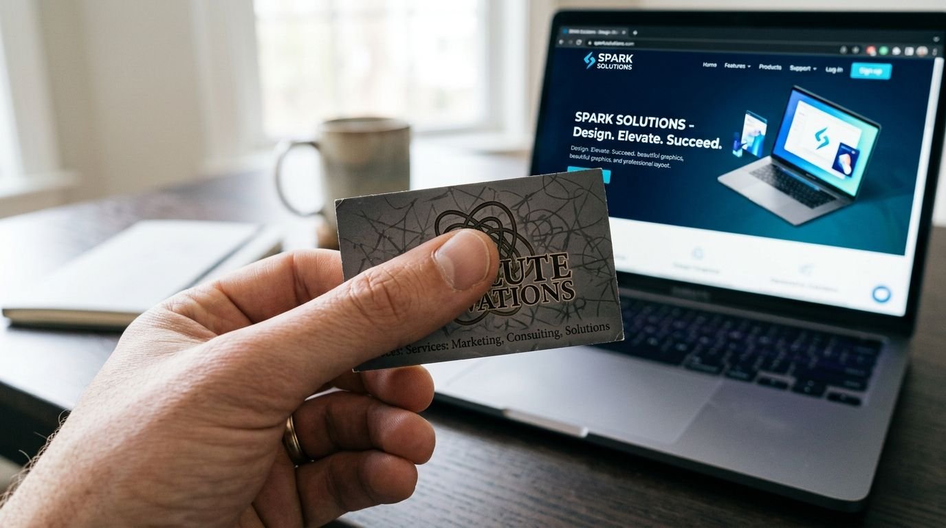
Most business owners think of a logo as a nice-to-have – a small graphic in the corner of a website or the front of a business card. In reality, it’s doing something much bigger: it’s making a trust decision on your behalf before a single word of your pitch gets read.
People form an opinion about a brand’s credibility almost instantly, often before they’ve read a headline or scrolled past the fold. A logo that looks unfinished, inconsistent, or generic sends a quiet signal: if the branding wasn’t taken seriously, why would the product or service be?
The five ways a logo quietly repels clients
It doesn’t scale. A logo that looks fine at business-card size but turns into a blurry smudge as a social avatar or favicon tells visitors the brand hasn’t been built for how people actually encounter it today – across a dozen tiny touchpoints, not one big one.
It’s inconsistent. A different logo version on the website, the Instagram page, the invoice, and the storefront sign reads as disorganized, even if each individual version looks fine on its own.
It’s generic. Stock icon plus a sans-serif wordmark is the fastest way to look like every other business that used the same template. Distinctiveness is what makes a brand memorable enough to be referred.
It has no system behind it. A logo without defined colors, typography, and usage rules gets reinterpreted by every new designer, printer, or intern who touches it – and drifts further from the original intent every time.
It doesn’t match the price point. A premium service with a bargain-bin logo creates cognitive dissonance. Visitors calibrate their price expectations visually before they ever see a quote.
None of this means every business needs a six-figure rebrand. It means a logo should be treated as an asset with real commercial weight – one that either compounds trust with every impression, or quietly erodes it.